Enhancing User Experience: NextJs Explorer UI Improvements

As our society continues to rely heavily on technology, the value of a user-friendly interface is increasing. We understand the significance of a good user experience, which is why we recently made some major improvements to our platform's UI.
New UI Design
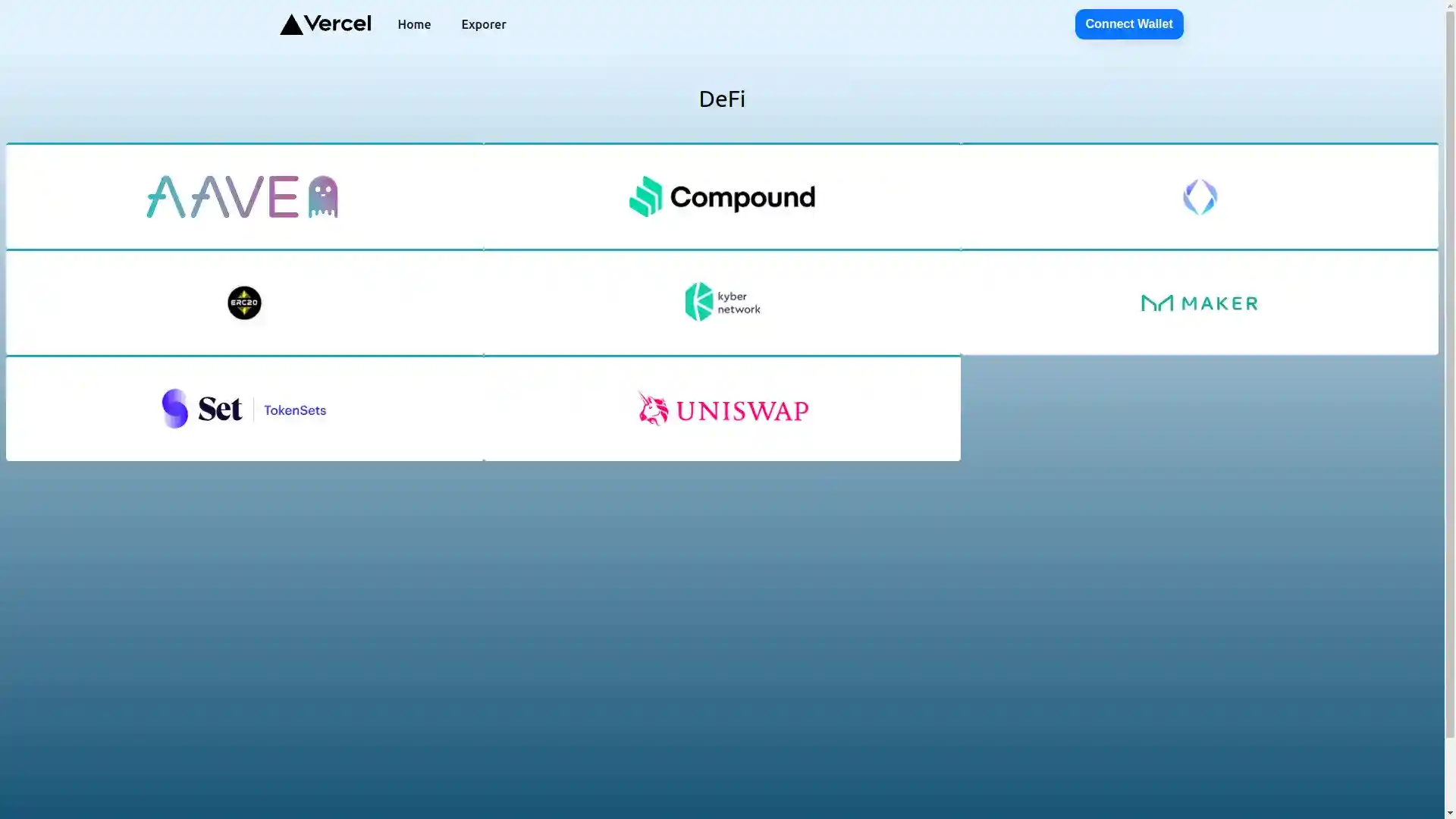
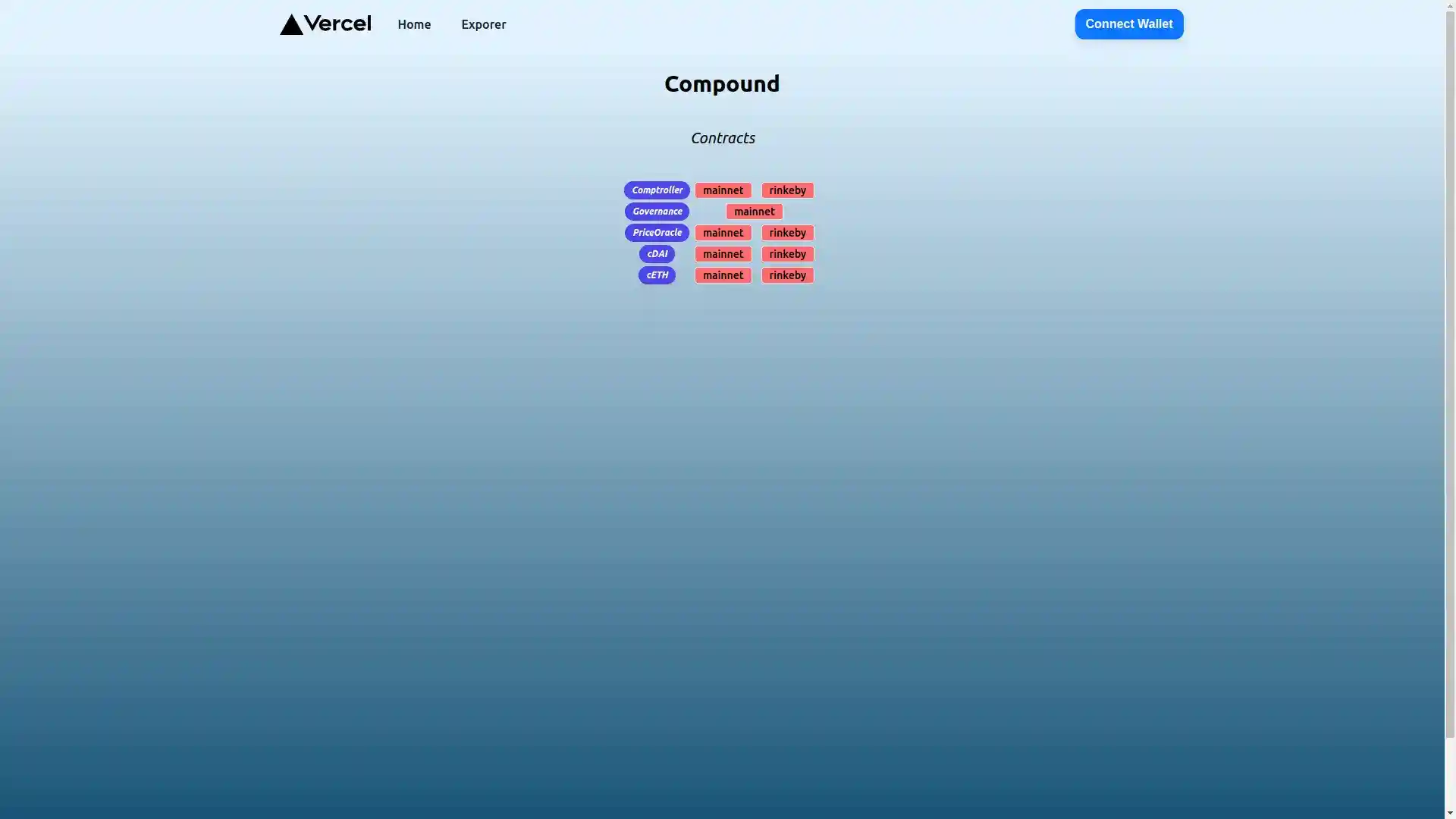
Our team has been working tirelessly to make the platform more engaging and intuitive for our users. We are pleased to announce that we have added new colors and buttons, restructured the layout, and added a feature to view the transaction details of a contract.
Search Card
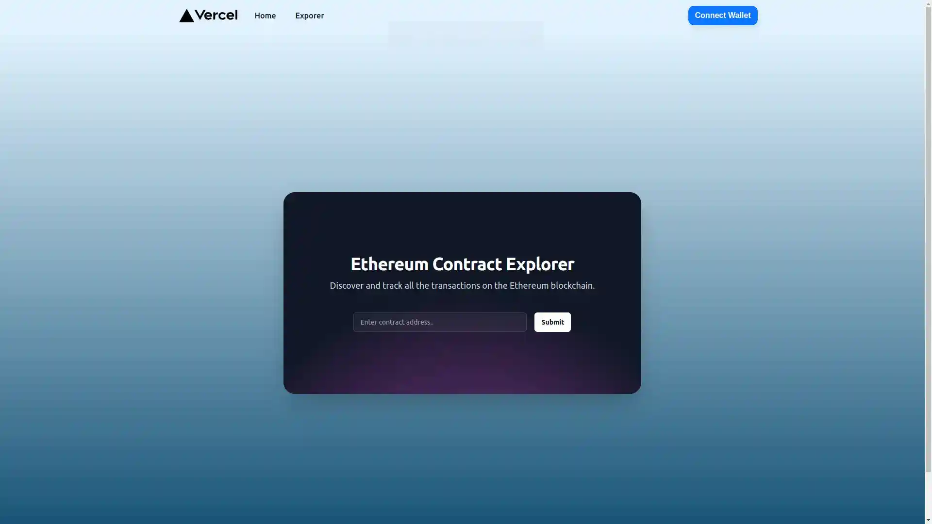
One of our main goals was to improve the search card experience. We recognized that users were spending too much time trying to search for information on the platform, so we optimized the search card to make it more efficient.
Transaction Details
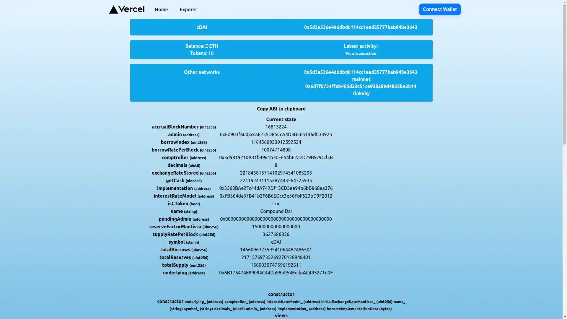
Our new feature to view the transaction details of a contract was also received with excitement by our users who were seeking a more comprehensive transaction view.
Upcoming Features
We've also started working on some additional features for the platform. In the next week, we will continue developing the detailed information view and begin working on the network activity view on the homepage.
Conclusion
These latest UI improvements are just the beginning, and we are constantly striving to make the platform a more enjoyable and seamless experience for our users. We believe that by continuing to listen to our users' feedback and implementing their suggestions, we can continue to enhance the platform's user experience.
Further Resources and Related Posts
- NextJs Ethereum Explorer
- Exploring and Refactoring Contraktor - Ethereum Explorer
- Exploring Ethereum Network with Etherscan and BlockScout
- Blockchain Data Indexer with TrueBlocks
- Advanced Realized Volatility and Quarticity
- Machine Learning with Sklearn
- How to illustrate log returns vs simple returns
- A How to EfficientNet Classification